

USER EXPERIENCE PROFESSIONALS ASSOCIATION - MINNESOTA
Changes were proposed for the UXPA-MN website based on remote and in-lab usability tests.
User experience Professionals Association - Minnesota
Opportunity Space
UXPA - MN asked that we make recommendations related to the general usability of their website as it relates to key tasks.
solution
Recommendations were given on two primary features: user profile pages and identifiable resources.
methods
Heuristic Analysis
In-lab usability tests
Remote usability tests
skills/tools
Sketch
Axure RP 8
BlueJeans
QuickTime

UXPA MN
User Experience Professionals Association Minnesota (UXPA MN) is a chapter of the international organization, User Experience Professionals Association (UXPA). UXPA MN is dedicated to supporting user experience professionals in the Twin Cities by providing networking and learning opportunities in the local UX community. Their website’s primary functions are to promote membership, facilitate becoming a member, and promote events. UXPA MN approached our team to identify and provide recommendations for how to resolve key usability issues on their site.
The users & the current website
UX professionals in the Twin Cities are constantly seeking opportunities to network and continue learning. After all, a UX professional is pretty much a professional student, constantly studying users and what makes a valuable experience. Early-career UX professionals are looking for support as they establish their careers, while established UX professionals are looking to engage and contribute to the local UX community as they advance their careers. The current website is aimed at providing these opportunities, but had some significant short falls.
The current Member Profile page
The current Home Page of the UXPA-MN website.
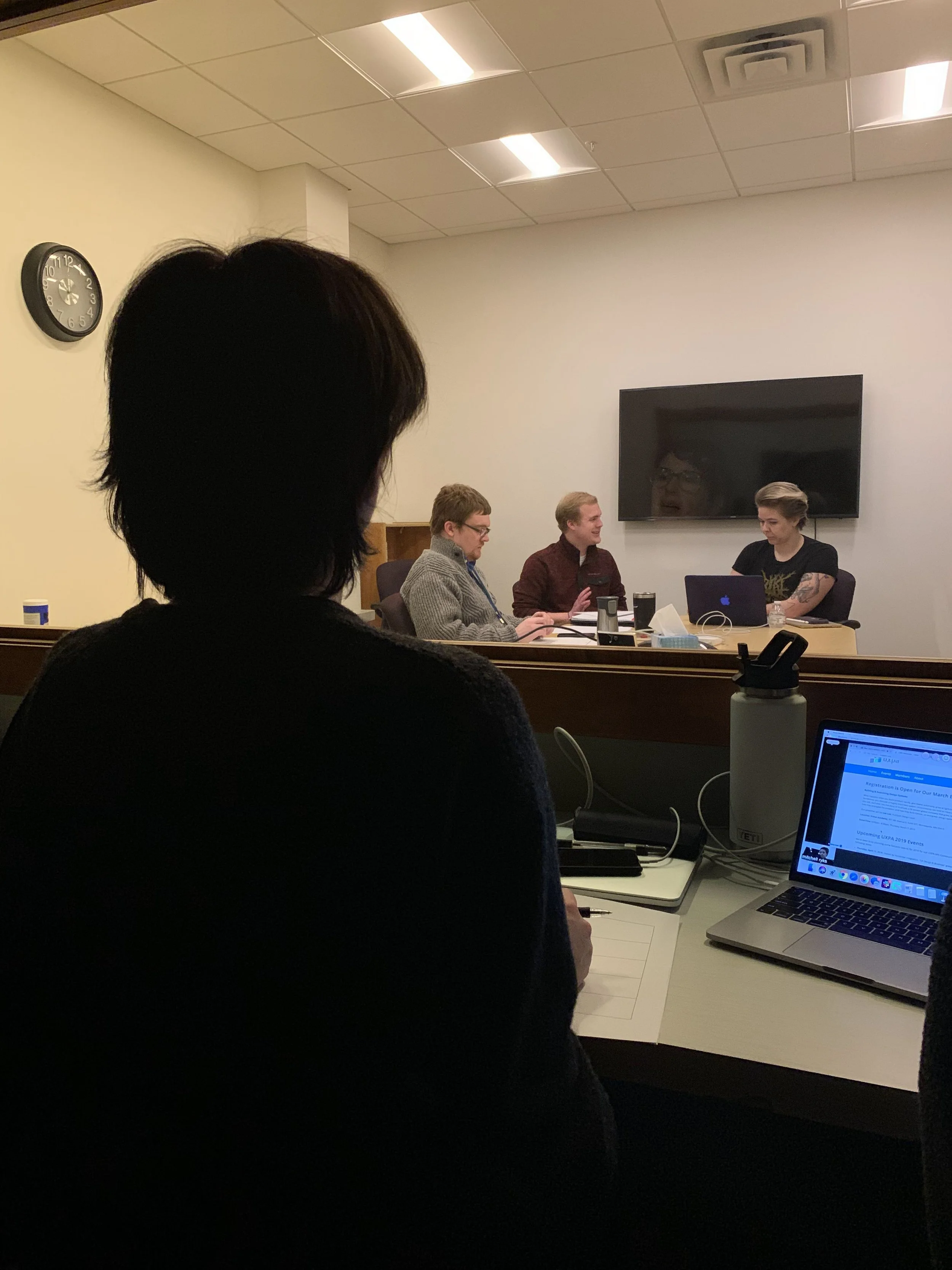
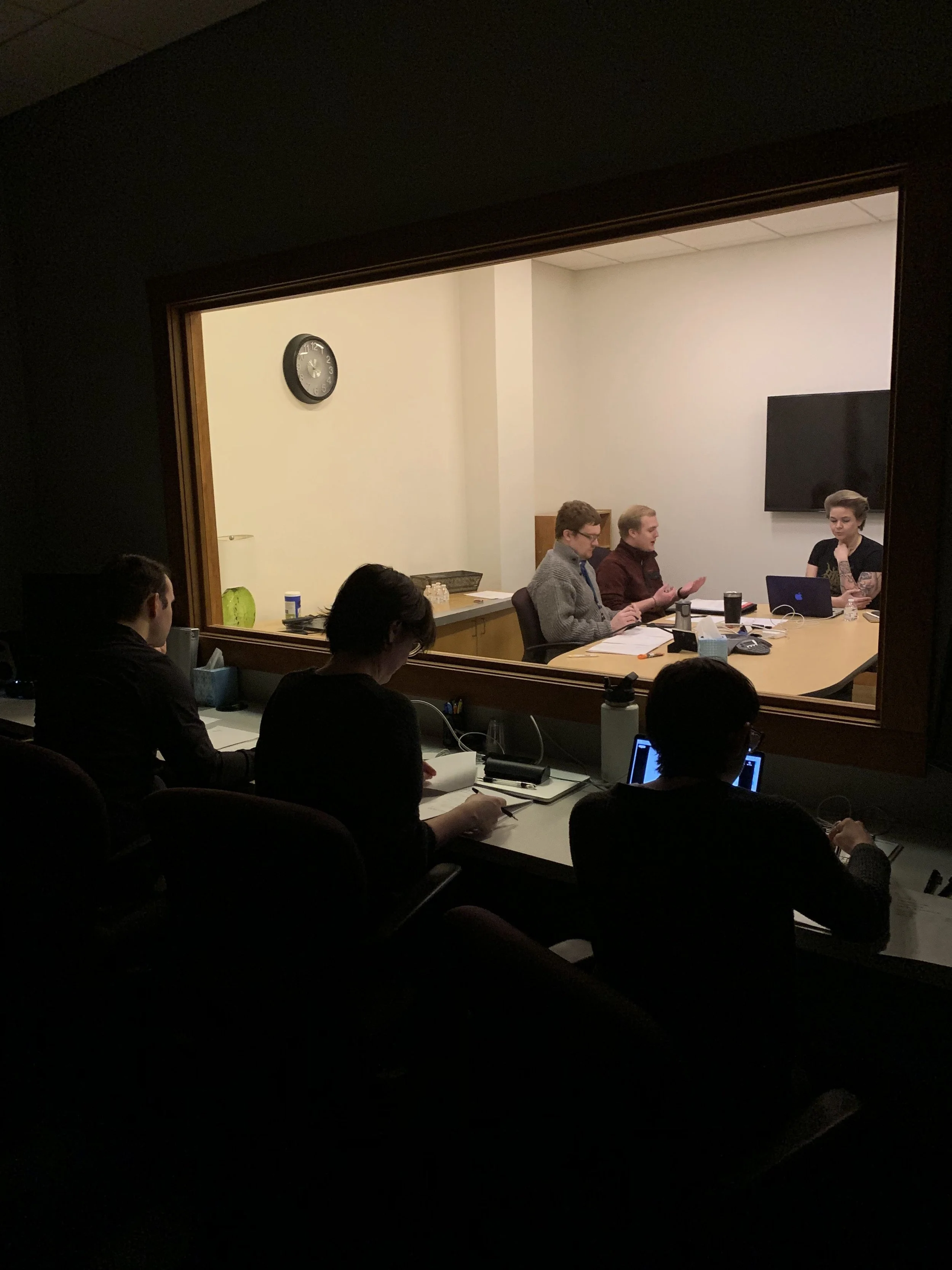
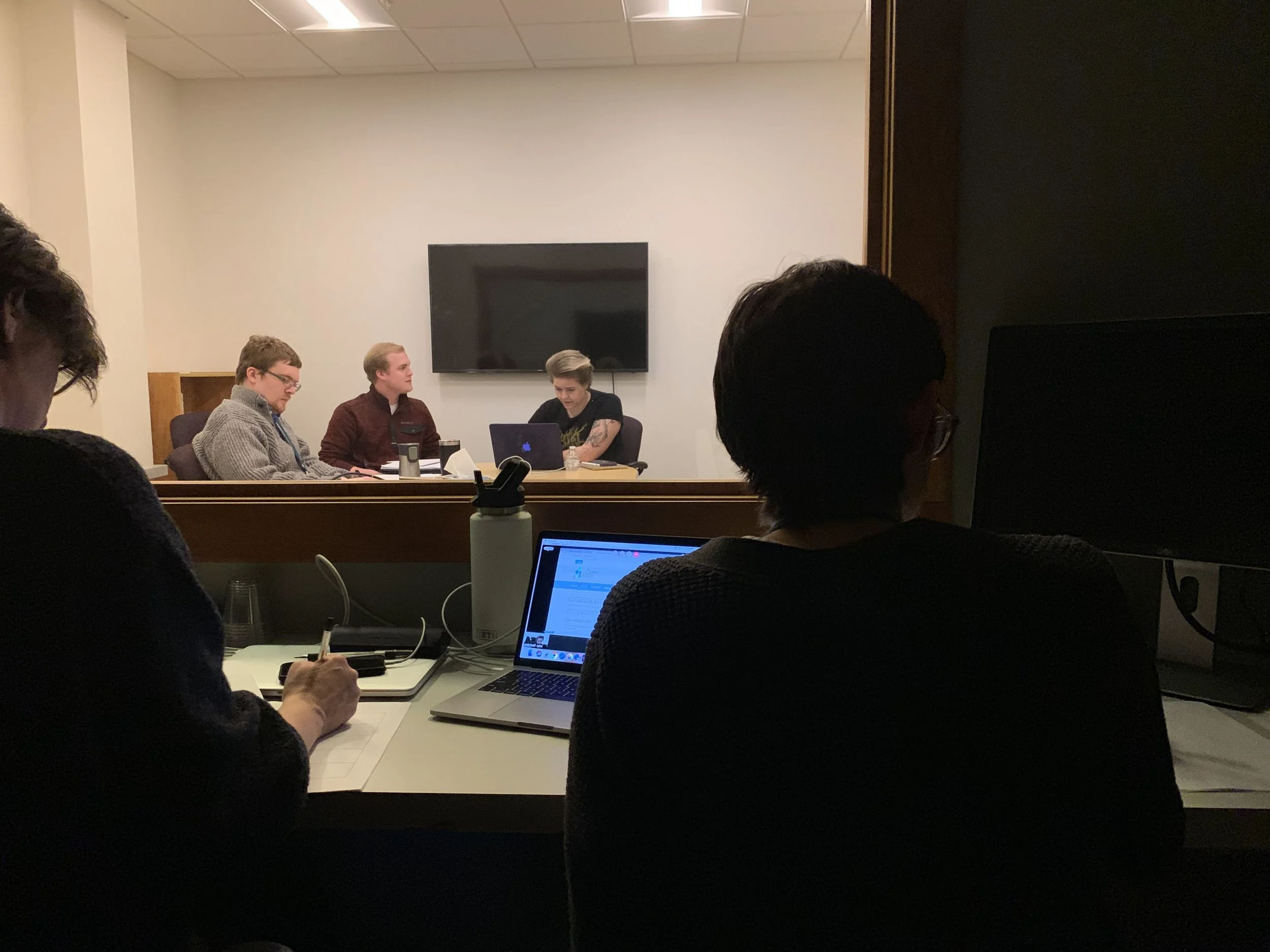
Remote & in-lab usability testing
In order to detect the usability issues on this website, our team conducted a total of 18 remote and in-lab usability tests. During these tests, we identified several features on the website that made it difficult for the participants to complete primary tasks. Some of the most critical issues that we identified were the lack of effective communication information, and the clear identification of resources. Member profiles contained very little information and the only contact information that was listed was a link to the person’s LinkedIn profile. Additionally, participants were not able to identify what resources were available on the website which clouded their ability to identify the purpose of the website and at times, even the organization as a whole. On a higher level, the overall experience of the website did not give participants a clear sense of trust in the organization as they expected a UX organization to have a high quality, easily navigated website.
recommendations
The recommendations that I made for the two critical issues identified through our usability tests were simple. The goal was to keep the design easy to navigate, while adding prominence to more important features. The member profile provides the option for the member to upload a picture of themselves. Additionally, contact information is brought up near the top of the profile page and offers the ability to enter email, phone number, LinkedIn profile, and even a space for the portfolio. This would help the website meet its goal of connecting the local UX community. The available resources were placed right on the home page. The purpose of putting this information right on the home page is to allow the user to notice the resources on an initial scan immediately when they get to the website. By adding more personal touches to the profiles, and increasing the prominence of the available resources, a great deal of value is added to the interaction that the user has with the website.


Click through the slideshow below to see All of my findings and recommendations.


